Context
Big cities are full of people, movement, and noise, yet they can feel deeply lonely. Every day, thousands of strangers cross paths on crowded streets, in busy cafés, on public transport, and in office buildings, rarely looking at one another.
Everyone seems to be rushing somewhere, focused on their own worries, schedules, and screens. In the middle of this constant motion, meaningful connection feels rare.
Details
My role: Product Designer
Duration: 3 weeks
Responsibilities: End-to-end process
Tools
 Figma
Figma
 Adobe
Adobe
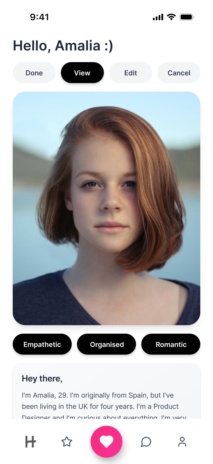
Let me introduce, Amalia :)

Amalia Rodrigues
Her life is a constant loop: wake up early, commute, work too much, head home exhausted, repeat. She's good at her job, but being dedicated has a cost. Long hours. No time. No energy.
She dreams of finding her other half, someone kind, someone to understand her, someone who sees her. But between work, exhaustion, and the loneliness she tries to ignore, she needs help.
She needs a way to connect in a world where genuine moments are rare.
For people searching for real connection in the middle of the crowd, dating apps become a bridge between isolation and possibility.
Hinge positions itself as a space designed to help people meet with intention, offering a way to slow down, learn about others, and create meaningful connections.
Discovery
I began my research by exploring the level of satisfaction among current Hinge users. I conducted interviews with 11 participants aged between 21 and 39, all of whom were single, actively seeking a relationship, and had previous experience using Hinge.
Why is this happening? What are users' main complaints?
Through the interviews, I found that despite Hinge's promise of meaningful connections, users often feel frustrated by a lengthy onboarding process, inactive matches, and conversations that fail to progress.
"At first, Hinge feels promising, but it quickly becomes exhausting. Setting up the profile takes too long, and even when I get matches, most conversations don't go anywhere. It's frustrating to put in effort and feel like nothing really happens."
"I like the idea of Hinge and the focus on meaningful connections, but the experience doesn't always match that promise. I often see the same profiles, match with people who never reply, and end up feeling discouraged rather than excited."
Using insights from user interviews, I created a priority matrix to identify and prioritise key user pain points before exploring potential solutions.
Matches don't lead to conversations & conversations die quickly
Many users get matches, but they rarely turn into actual chats
Reason: People lose interest, forget to message, or swipe passively without intent
Low-quality & inconsistent matches
Users feel they don't get matched with people who align with their preferences
Reason: Algorithm limitations, location issues, or profile mismatch
Too many inactive & ghosting users
Users report matching with people who never respond or disappear instantly
Reason: Inactive accounts still shown, burnout, or emotional fatigue on dating apps
Repetitive profiles and prompts
Profiles often feel generic or unoriginal
Reason: Limited variety of prompts and photo types
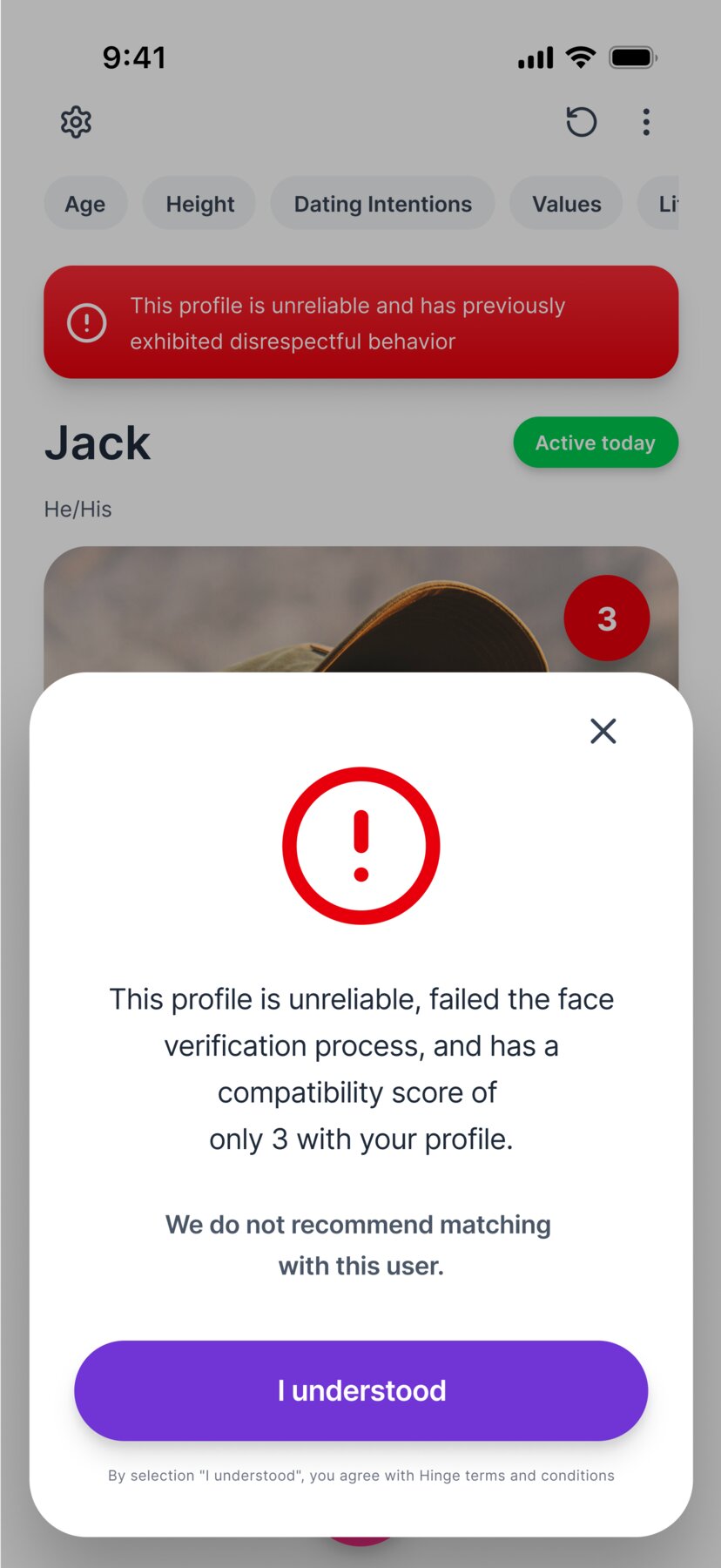
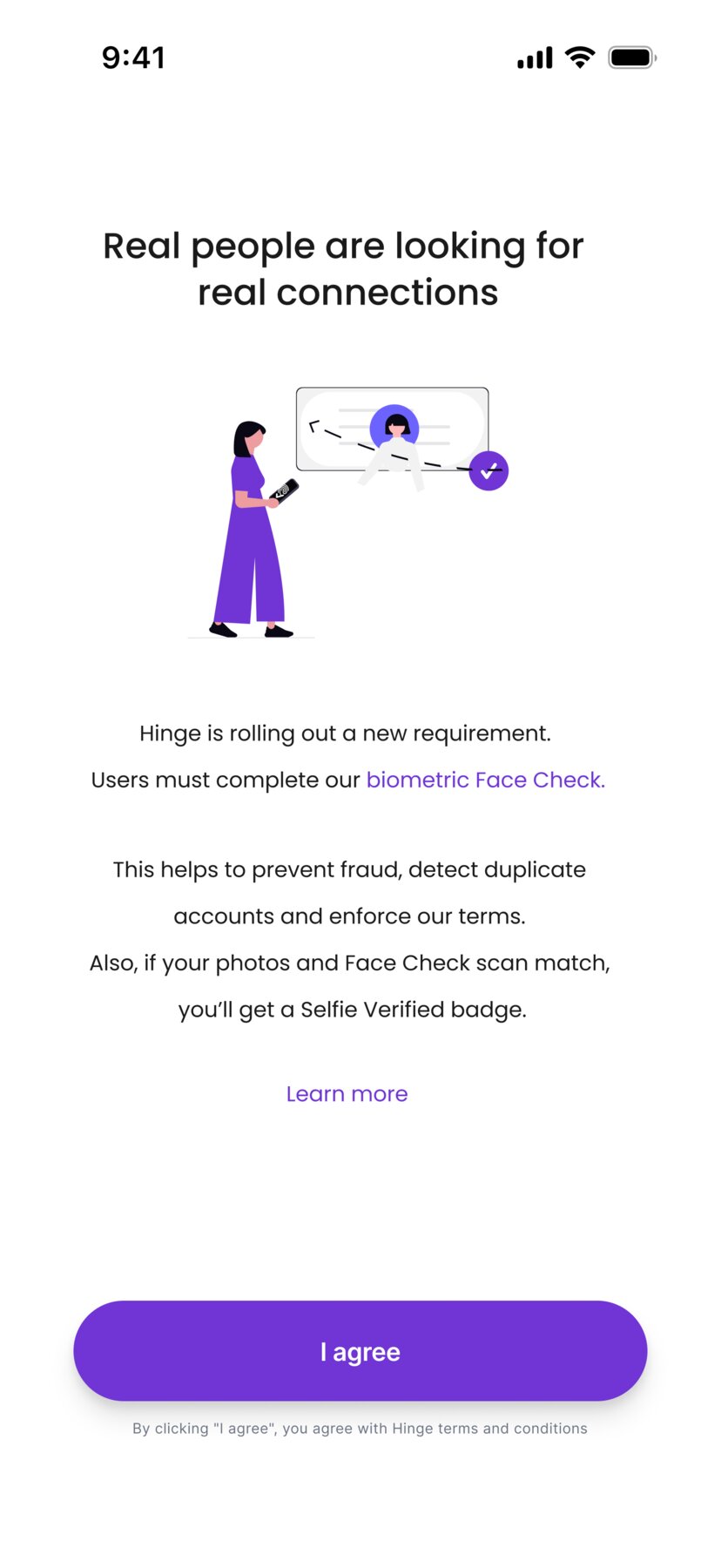
Safety & authenticity concerns
Users encounter catfishes, fake profiles, or uncomfortable interactions
Reason: Limited verification tools and an ambiguous reporting process
Poor user experience in messaging
Some say the chat interface feels basic or too similar to other apps
Reason: Lack of richer conversation tools or ways to keep chats engaging
Emotional fatigue & dating burnout
Users feel tired, discouraged, or overwhelmed
Reason: Too many options, low follow-through, and repeated negative experiences
Profile creation process too long
Users complain that filling out a Hinge profile takes too much time
Reason: They need to go through multiple steps and screens
Limited free features
Some feel pressured to pay to see likes or access useful tools
Reason: Paywalls for core features like seeing everyone who liked you
Ideation
During the ideation phase, I synthesised the insights gathered from research and to clearly define the goals and success criteria for the product.
This process helped me visualise potential solutions and outcomes, allowing me to explore different approaches before translating the strongest ideas into initial wireframes.
Iteration
I conducted usability testing with 10 users and then iterated on the wireframes based on the insights gathered.
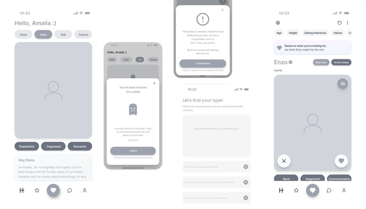
The onboarding felt much faster and more intentional. I really liked being able to skip optional questions and save things for later without feeling stuck. The compatibility score and shared interests made it much easier to understand why I was seeing certain profiles.
The verification badges and face check made the app feel a lot safer than before. I also appreciated the alerts for suspicious behaviour. It gave me more confidence to actually engage in conversations. Overall, profiles feel more real and trustworthy.
Limiting matches helped me focus on real conversations instead of endless swiping. Seeing shared interests directly in the chat preview made starting conversations way less awkward. It feels more human and less like a numbers game.
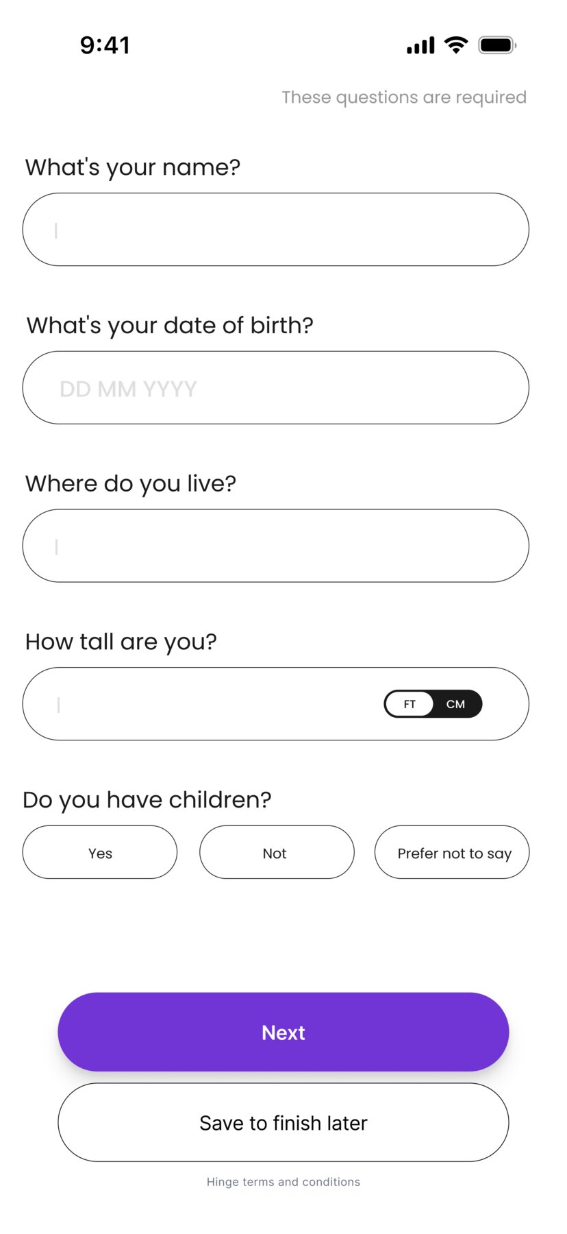
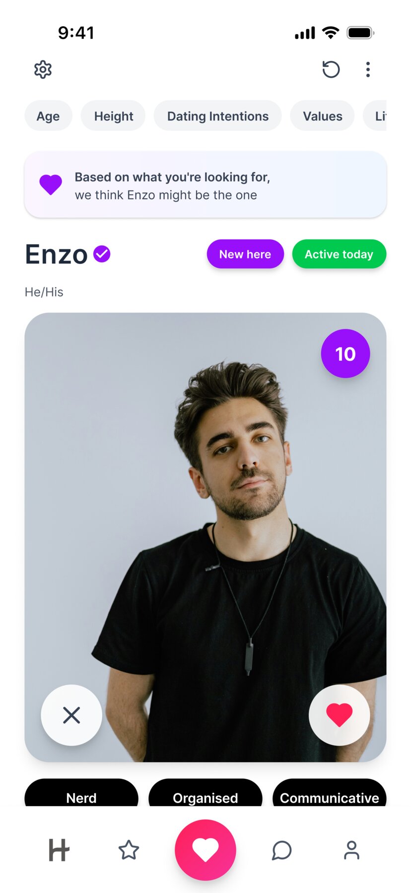
Simplifying the profile creation experience
- A simplified questionnaire with more questions on a single page, reducing boredom and lowering user drop-off
- Dividing questions into "required" and "optional," giving users more control
- Introducing a "Save for later" button to allow users to complete their profile at their own pace
Promoting respectful and authentic profile behavior
- Introducing risk detection alerts to warn users of suspicious behaviour
- Visible verification badges for trustworthy profiles
Improving match quality and relevance
- Introducing compatibility scores
- Adding smarter filters based on values and lifestyle
- Making deeper profile questions
- Providing clearer explanations of why you see each match
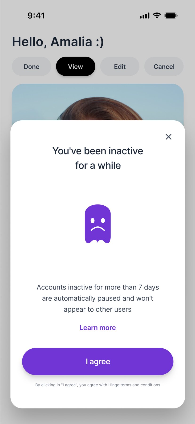
Reducing inactive users & ghosting
- Limiting user inactivity to 7 days, after which their profile will no longer appear
- Limiting the number of matches to 8, preventing inactive matches
Enhancing the messaging experience
- Introducing shared interest tags in chat previews to help users start conversations and break the ice
Enhancing profile quality
- Introducing profile creation with custom text
- Allowing users to add personality words that describe who they are
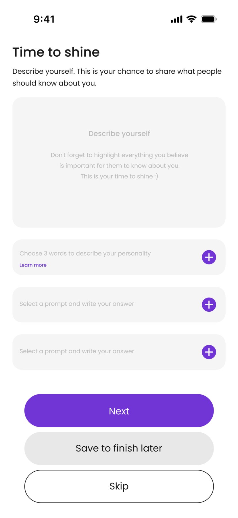
Empowering the profile creation experience
- Introducing profile creation with custom text
- Allowing users to add personality words
- Giving users the ability to clearly specify exactly what they're looking for
Strengthening safety & authenticity
- Adding stronger verification methods, such as video selfies and live photos
Reflections
While working on this project, I learned that small UX details have a significant impact in dating apps. Elements such as microcopy, spacing, and feedback strongly influence how comfortable users feel.
User testing revealed that there can be a gap between what users say and how they actually behave, making direct observation especially important in a redesign context.
I also learned the value of iterating early. Even quick usability tests uncovered issues and highlighted clear improvements I might not have identified on my own.
Ultimately, this project reinforced how UX decisions affect not only usability, but also user confidence and trust.